Companies need employees that can complete both creative and technical projects and our students can deliver on that need.
The Digital Media department will prepare you to become a content creator in a world constantly being shaped by technology.
GU's digital media major provides a comprehensive curriculum that helps you gain skills in graphic design, photography, video, animation, programming, audio editing, and web design. Prepare to create content in a world constantly shaped by technology.
Are you creative? Are you tech savvy? This degree plan provides tracks that give you the option to fulfill your passions. Lean Graphic Design, Video & Film, Internet Development, Audio Editing, Audio Engineering, Journalism, Digital Marketing, and Media Storytelling.
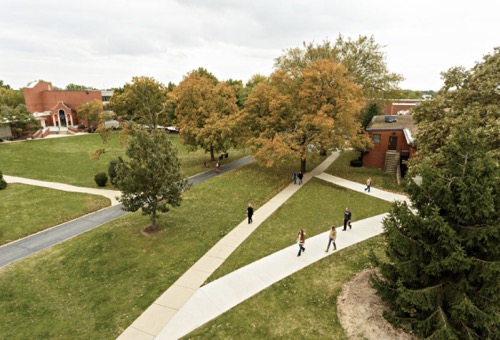
GU in a View
Three year degree
Elect to earn your degree in digital media in just three years with our accelerated program.
GU in a View
Find your creative self here
Create media in a safe and encouraging atmosphere. Learn the latest tools and techniques. Work with others to create complex interdisciplinary projects. Combine faith, art, technology, business, and culture to produce work that is useful and enlightening.
GU in a View
Build your portfolios
Develop a broad digital media portfolio. View our creative work on the GUDM website. You'll see what current students and alumni are doing with their digital media degrees.
Why GU
Opportunity to Showcase
With the Papyrus student newspaper, The Vista student magazine, and video crew, you’ll find several avenues to showcase your talent. Be one of the many GU students who earn an American Advertising Award or other awards from competitions sponsored by the AIGA, the Associated Collegiate Press and the College Media Association.
Hands-on Experience
Our professors give you the attention you need and challenge you to pursue projects that grow your skills. You’ll work in a dedicated Apple lab with Adobe Creative Cloud access. Develop your skills using digital cameras, light kits, drones, green screens, and podcasting equipment.
Internships
Discover more than a dozen ways to intern as a DM student on campus or use our connections to gain experience nationwide. Graduates of our programs have completed internships in Chicago, New York City, Los Angeles, San Diego, St. Louis, Nashville, Indianapolis, and more.